The ads that are targeting me most on my social media (mainly facebook) are usually from clothes companies like Wish, Dress Lilly, Groupon, etc. I also get quite a bit from Michael Kors and Coach, Wayfair, and beauty products (mainly nail stuff and hair tools).
These ads can be effective because I believe they are generated by purchases that I have made through my FaceBook page. They know what I like, so they inundate my newsfeed with ads, trying to entice me. I believe that the beauty products ads are because I worked in the beauty industry for so many years so they assume I’m into the newest trends in hair and nails. These types of ads often pull me in because they are advdertising sales and limited time offers.
Companies can track the success of their ads by looking at their click through rate and then their ROI.
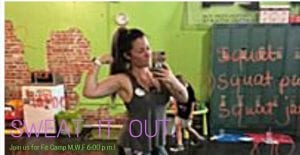
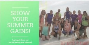
MOCKUP ADS
Faceboook: This campaign is inviting people to come to
Fit Camp. Angela conducts a fitness class three times a week and pulls in her Herbalife products throughout the workout. The objective is to entice people (especially woman) to come join them for Fit Camp, so they too can look and feel better about themselves.
My budget would be $100.
LinkedIn: I did this campaign for LinkedIn a little differently in hopes to make it look a bit more professional, or business like. The objective would be to get peopole thinking about their health and fitness and maybe even a new or additional career choice for them. This ad could target man and woman of every age that is looking to make a change in themselves physically or financially.
My budget would be $50.
Twitter: This ad that I would post on Twitter is for Beach Camp. A fun and effective way for people to get some exercise while enjoying the beach. I would say that this ad would be targeted to both man and woman in the young adult age group.
My budget would be $100.


I like the concepts of your ads, Melissa. A few recommendations:
– In the first ad, put a 60-80% transparent backdrop box behind the text box so the font stands out from the image.
– Make the fonts larger so it’s easier to read.
– Consider putting a specific deal or call to action on top of the image in Ad #2 – so not all of the wording is crammed in a little box on the left.
Thanks for the feedback!!